This week the sea went from this:
to this.
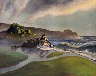
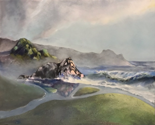
More accurate, but I like it a little less.I’ll have to check the contrast and see if I overcorrected.

Putting the TMI in absentminded
This week the sea went from this:
to this.
More accurate, but I like it a little less.I’ll have to check the contrast and see if I overcorrected.
4 responses to “Weekly Paint Progress: 2/9”
It is wild to see how the painting can change so much in intensity – did you paint over the whole thing in a wash or three? Or is that just what happens to the overall effect when you make a few changes?
(I think some parts are an improvement – the reflection+land looks more plausible – and other parts are more interesting in picture 1. So it goes?)
KC – I washed it out too much – too carried away. I just think it needs a few washes of color glazed on top of the extra white. I did literally mix oil and white on a broad latex paintbrush and slap it on. Well it’s not a watercolor, just need a week or so to throw on some paint again.
It is so cool that you can do that, but yes, it would maybe like some of its contrast back in some areas, sigh.
(so cool that you can just… wash a slight layer of color/white over it, though!!! I have never done oil painting, so the mix of opaque and transparent is a new thing for me.)
KC – you really should try oil painting. it’s much easier than people let on.